


Koh Phred
Brand Identity

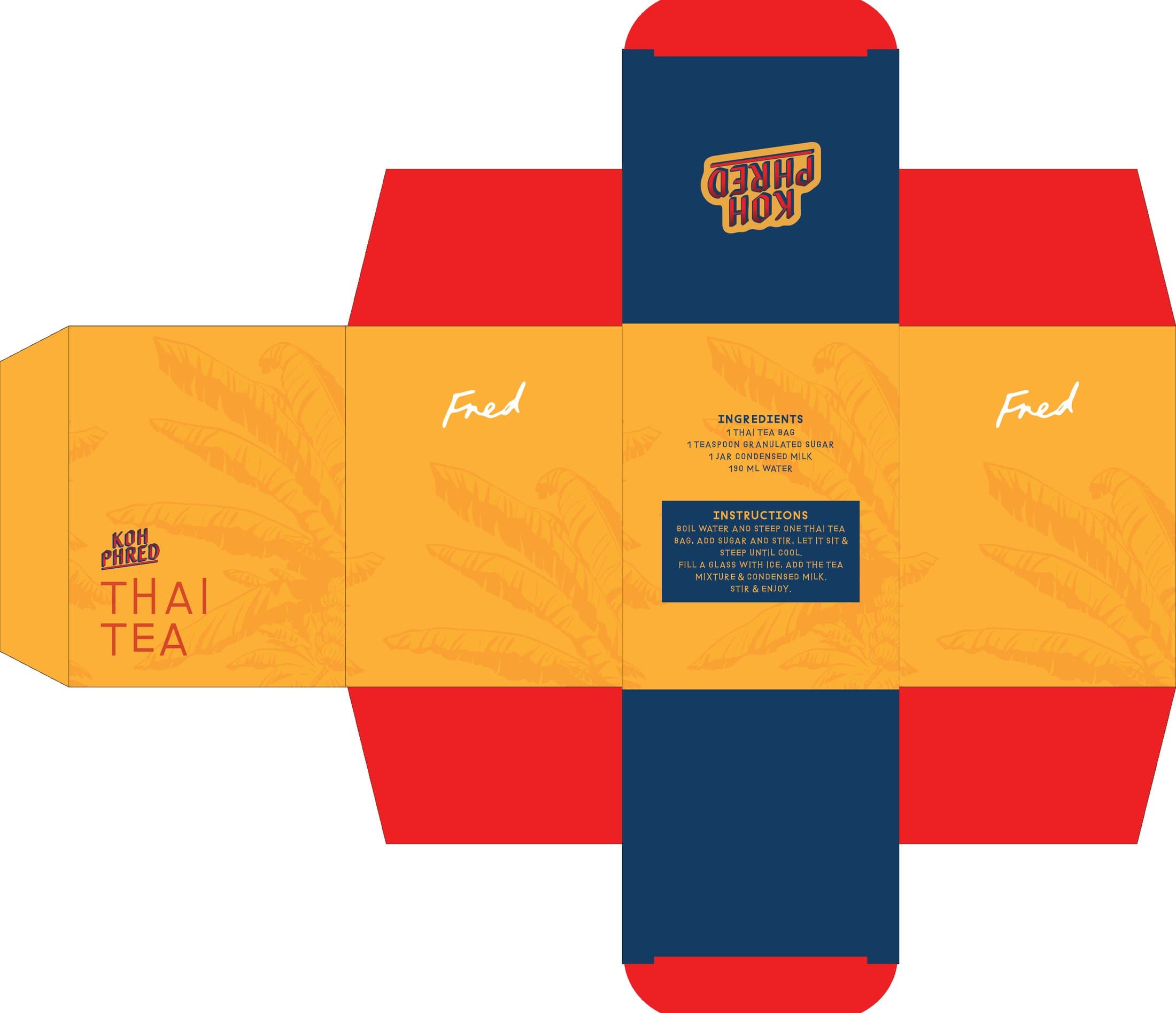
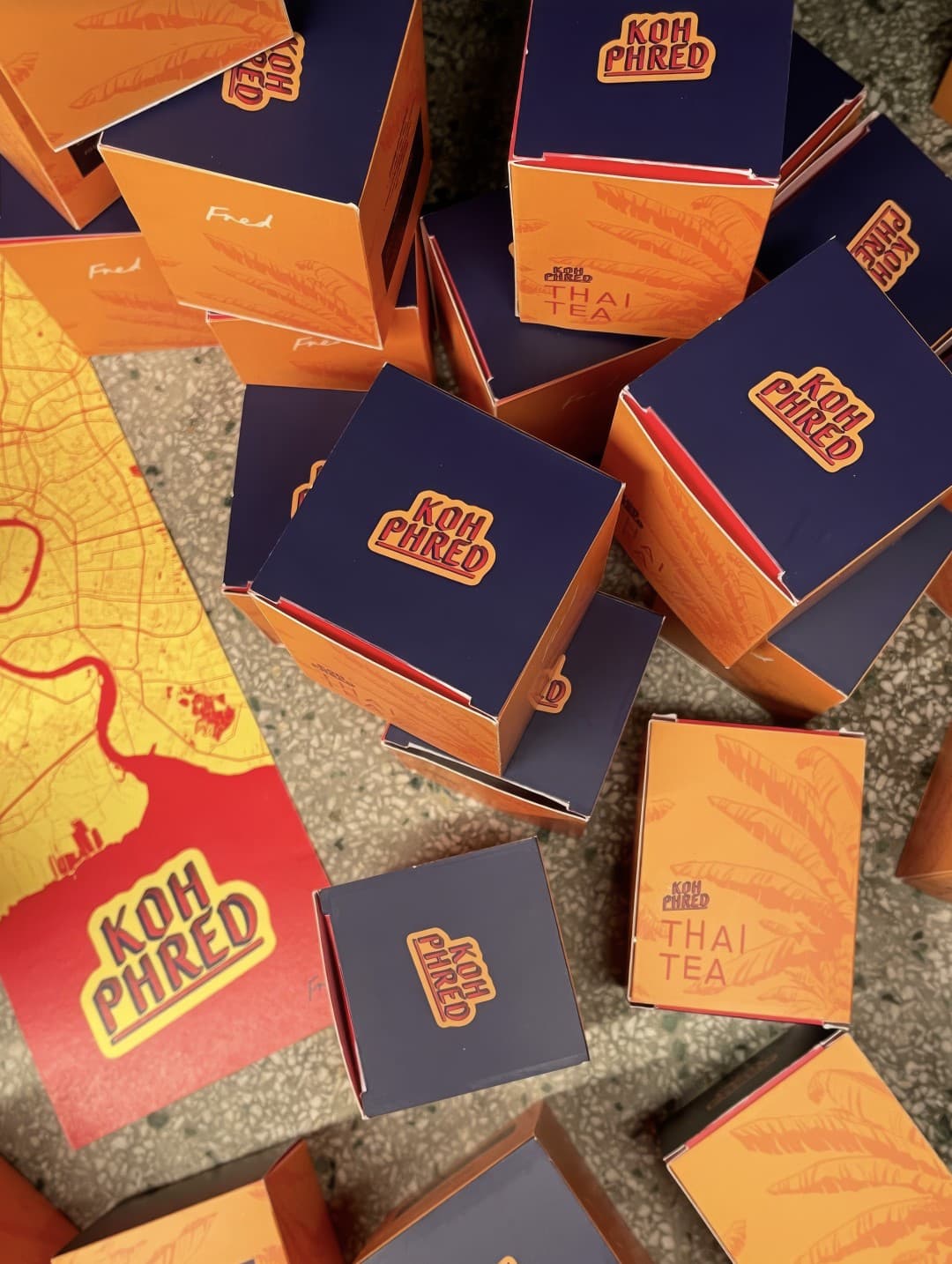
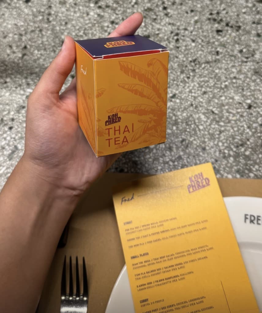
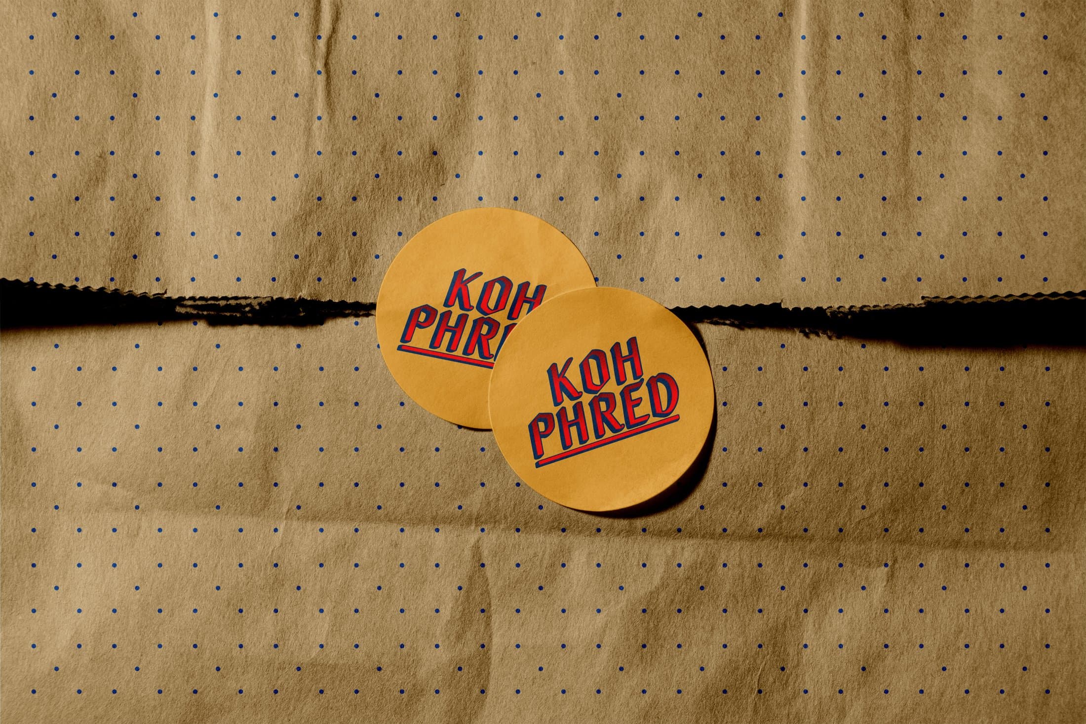
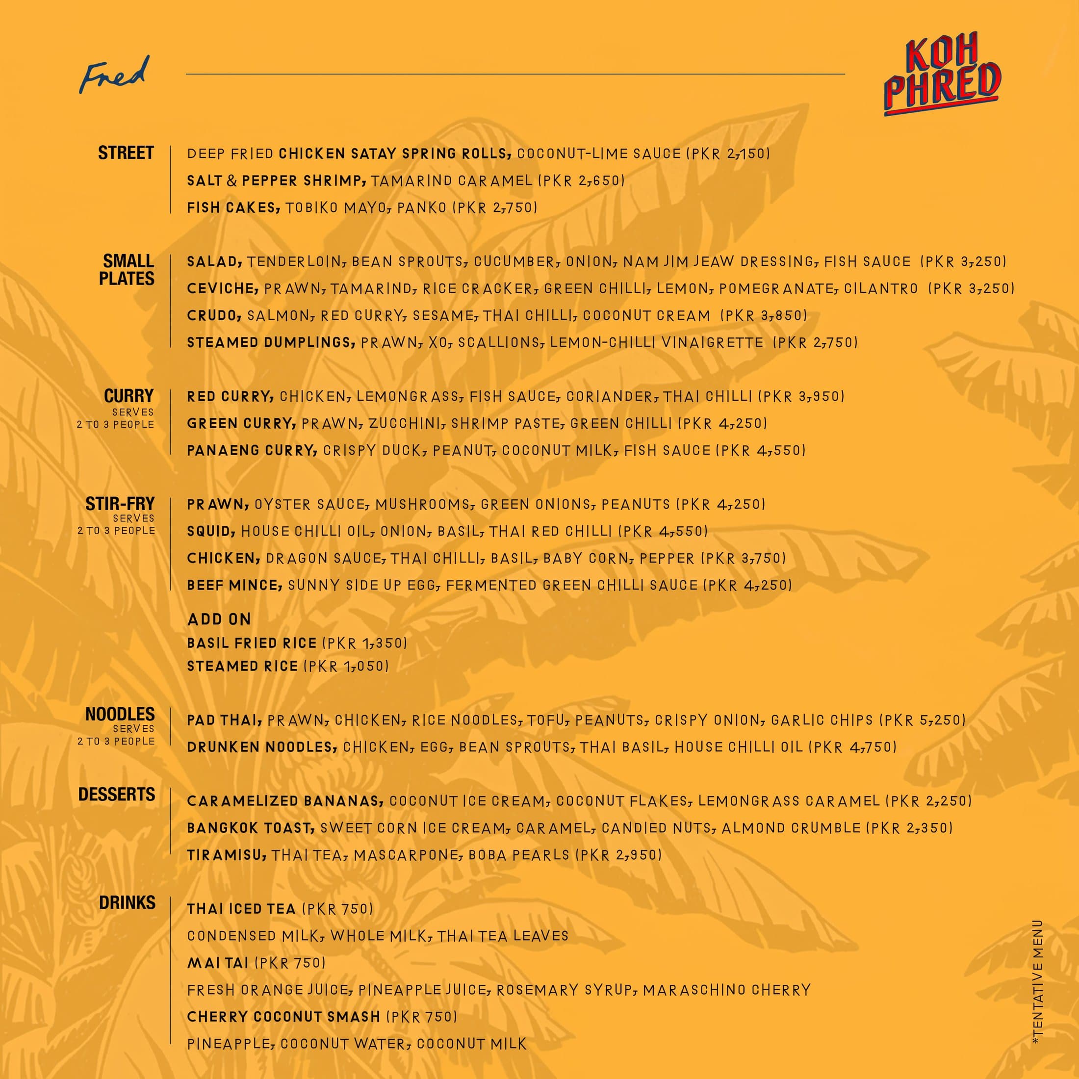
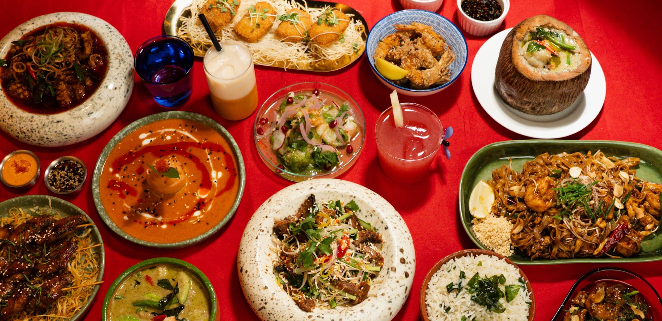
Koh Phred was a Thai food pop-up at Fred the restaurant, a celebration of Thailand's bold, vibrant flavours, brought to life across logo, menu, Thai teabag box packaging, and social media. The visual direction pulls from the feeling of a Bangkok summer, palm trees, warm coastal light, the kind of heat that colours everything around it.


∠8°
Chilli Red
Dusk Navy
Turmeric Gold
Papaya Yellow

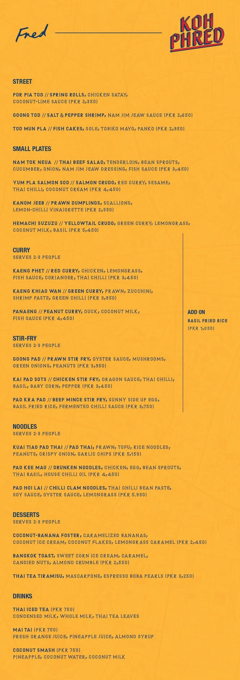
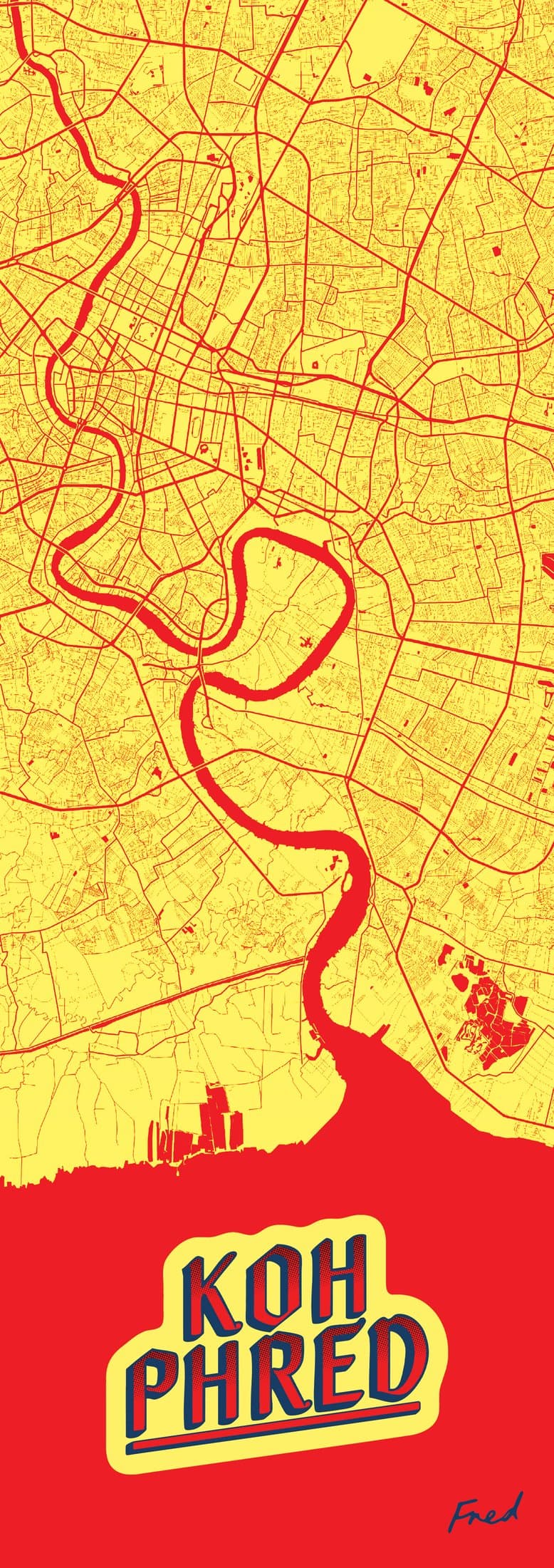
The palette leans into vibrant, warm tones rather than literal postcard imagery, more the mood of the place than a copy of it. Bold without tipping into cliché, vibrant without losing warmth.